
Researching Navigation
As the Business Mobile app was being redesigned, the design team recognized the importance of reviewing the navigation and information architecture. The existing navigation had several best practice concerns, and users were struggling to locate items. In addition to my redesign responsibilities, I collaborated with our UX Research team to uncover further insights.
TEAM
Lead UX Designer (myself)
UX Researcher
MY ROLE
PROJECT
Research Spike
6 Week Timeline
Background
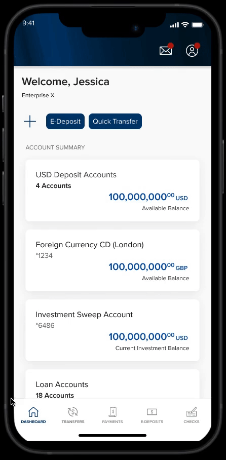
The bottom navigation contained multiple problems and we recognized that improving it could significantly enhance the app's usability. Our hypothesis was backed up by user feedback which indicated an unintuitive structure and confusing interface.
The Personal Banking design team was also working on navigation and requested that we share our findings with them.
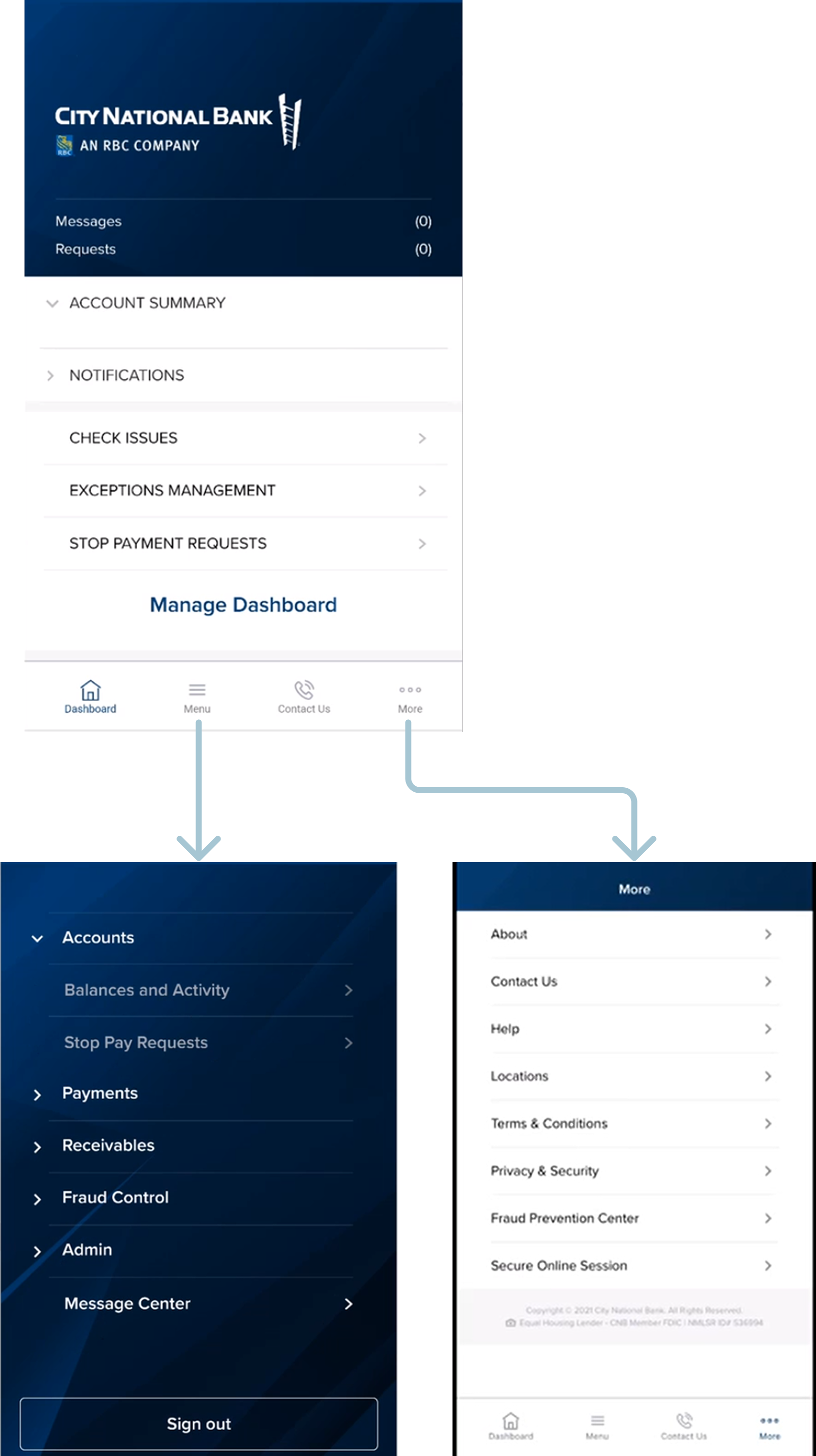
Two different menus in the bottom navigation
Research and Design Plan
Discovery
Problem Framing
“How Might We..” statements, hypothesis, and objectives to identify research methods
User Survey
Compiled the most common tasks and ran a survey to learn frequency and importance
Sitemap
A full sitemap of the app was created to understand the current experience
Competitive Analysis
Collected similar use cases in the financial industry
Ideations
Navigation/Wayfinding
Choosing the ideal navigation pattern and wayfinding paths
Tree Diagram
Created a new hierarchy based on the User Survey prioritizing most common tasks
North Star Design
As the app is rolled out in phases, design the ideal end experience.
Testing
Single Click Test
Determine usability by seeing where users click first when asked to complete a task
Problem Framing
The UX Researcher and I, worked together to define our objectives to figure out which research methods to use.
How Might We...
..make navigation easier?
..provide users with a more predictable experience?
..design for use cases with different banking needs?
Hypothesis
Place commonly used features in the bottom navigation.
Placing links in predictable areas will be more intuitive.
Designing for the most extreme case will benefit most use cases.
Objectives
Understand how users want to use the bottom navigation.
Understand user expectations on link locations.
Design for the ‘super user’ and see if designs can be scaled down for other use cases.
User Survey
We used surveys to learn the frequency and the importance of in-app tasks.
Key Insights:
View Balance, View Transactions, Deposit Check, and View Deposits were the most common tasks
Checking Messages unexpectedly scored as a common tasks
Tasks scores fell into distinct high, middle, and low groups
Stop Payment and Manage Users scored low on frequency but high on importance
Tasks around ‘Approvals’ and ‘Transfers’ scored highest in the importance metric
Sitemap
Competitive Analysis of Navigations
Key Insights:
All banks used a version of a Hub and Spoke structure
PayPal’s navigation has a comparable range of features to CNB
Transfers are often grouped with Payment services
Banks with a menu in the bottom navigation have low ratings in the app store.
Design Rationale
The survey revealed that users view all tasks to be important so we prioritized a navigation hierarchy based on the most common tasks.
We chose to replace the burger menu with a bottom navigation so we can make the common tasks easier to access.
Approvals and messages are reactive tasks so we used icons with badges to indicate actionable items and placed them on the header for easy access.
Customizable quick links on the dashboard would accommodate for different use cases.
Hub and Spoke Pattern
Surveys show users complete their tasks when started.
Once a task is completed, they can be brought back to the Hub.
Tasks can be found within 0-2 “clicks”.
Object Oriented UX
We approached the navigation with an Object Oriented UX mindset.
Organizing the navigation with objects and instances align with user expectations.
We can account for different use cases by removing instances as needed.
Reduces friction for development and integration of third-party vendors.
Nested Layer UI
As Users move deeper into the app the UI can provide a visual que to their location.
Applying this to the header element would be effective since it is highly visual and frequently used.


Navigation and Wayfinding Patterns
Rationale
The First Click Test is an inexpensive and quick way to test usability of the new design.
The testing assets are easy to make and the results are straightforward.
Questions
Will users easily find tasks with the new navigation?
Will users correctly identify icons without text?
Methodology
Test was moderated by our UX Researcher.
Participants were given the 8 most common tasks and asked where they would click first.
The results were recorded and presented in the readout.

First Click Test
North Star Design
We put together a wireframe of a potential navigation redesign.

Wrap Up
While the immediate findings were not implemented in to a design sprint, we uncovered valuable insights into how users are interacting with or app. The team was also successful in negotiating a research spike to discover a critical user insights that influenced design strategy across all design teams.
Big Wins:
Significant insights into core user behavior
Found Qualtrics to be a quick and effective research tool