
CASE STUDY
GreenFi: Elevating Climate Friendly Banking with User Centric Design
Designer-Consultant
I joined GreenFi to optimize the user experience of their climate-conscious banking app, specifically addressing three critical areas:
New user onboarding
Communicating climate value
Enhancing financial transparency
MY ROLE
I led the end-to-end product design for GreenFi’s onboarding and monetization experience, working as the sole designer on the project.
🧠 Owned UX Strategy
Focusing on reducing friction and improving clarity for onboarding and revenue streams.
📊 Data Informed Design
Partnered with analysts to define success metrics and iterate based on A/B testing.
🤝 Cross-functional Collaboration
Worked with Product, Engineering, and Growth to align on priorities and ensure smooth implementation.
📐 Hi-Fidelity Prototypes
Designed and shipped UI in a fast-paced, agile environment.
CHALLENGES
Onboarding Barrier
Newly signed-up users landed on the dashboard with no guidance on depositing funds—resulting in confusion and friction.
Climate Impact
Users didn’t see how their actions contributed to environmental benefits, reducing motivation for engagement.
Banking Transparency
There was limited visibility into how users could engage with eco-friendly features and understand their financial impact.
DESIGN STRATEGY & SOLUTION
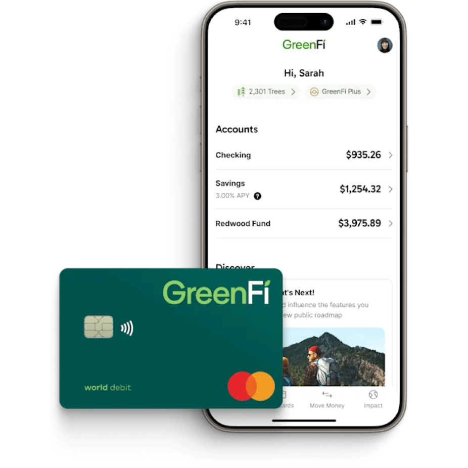
Account Setup Guide
Introduced a contextual onboarding card at the top of the dashboard—visible yet non-intrusive, sitting just above the ‘Accounts’ section.
Setup was turned into an engaging, meaningful experience by walking users through account funding and clearly sharing the environmental benefits of banking with GreenFi.
💫 Impact: Improved Conversion
Before: 42% of users completed initial account setup
After: 63% completion within first 24 hours
+21 percentage points, attributed to contextual onboarding guide and progress indicators.
DESIGN STRATEGY & SOLUTION
Gamified Completion Experience
Designed progress-tracking variants for key actions: “Fund Your Account,” “Plant Your First Tree,” and “Shop Sustainably.
Once all tasks were completed, users could dismiss the guide—delivering a sense of accomplishment and avoiding clutter.
💫 Impact: Improved Engagement
Before: 19% of users used the "Plant Your First Tree" feature
After: 38% interaction within first week
2x increase following integration into onboarding tasks.
DESIGN STRATEGY & SOLUTION
Revamped “Pay What Is Fair” (PWIF)
Problem: Voluntary fees during signup ($0–$20/month), though generating ~$3M/year, had low conversion and disrupted the onboarding flow.
Solution: Postpone Fee Ask
Moved PWIF out of the initial sign up. Instead we introduced it after letting users first experience app value in order to boost acceptance potential.
Solution: Amount Selection UI
Reducing friction by replacing a difficult-to-use slider with simpler, tappable buttons for preset donation amounts.
NEW
Supported By Data
A recent survey found that 85% of customers would recommend GreenFi to a friend or colleague, indicating strong user satisfaction. Allowing users more time to experience the app before requesting a donation could help improve conversion rates.
DESIGN IMPACT
🚀 Enhanced Onboarding Experience
A smoother, guided introduction that increased task completion and user understanding.
🌱 Stronger Engagement with Climate Features
Clear visibility of eco-impact encouraged deeper interaction with offered tools.
📈 Optimized Conversion Flow
By delaying the PWIF request and simplifying input mechanics, the design is projected to increase conversion while preserving a core revenue stream.
REFLECTION
This work reinforced design’s role as a strategic piece, not just to solve usability issues, but to influence business outcomes like activation and revenue.
As the lead designer on this project, I had to think beyond pixels, aligning stakeholders around the right problems, pushing for clarity in a complex product, and making sure the solutions were not only user-friendly, but feasible and measurable.
It was a reminder that at a leadership level, great design means driving clarity across the entire product team, not just in the interface.
© Eugene Park, 2025